Latest Mobile App Design Trends

Mobile app design will always take influence from graphic and web design, but it is the seamless user experience that now seems to shape these future trends. Some designs will fade in the dust while others will shape into a timeless concept, therefore the design community must always be ready to adapt. The following year will bring a whole new set of ideas, and this article is a collection of the most influential mobile app design trends projected for 2019.
Natural Experience (NX): A more Humanised App Design Trend
The user experience (UX) is now a mainstream concept that is important for all aspects of interactive design, but it seems the designer now needs to consider the integration of natural experience (NX). A relatively new concept, detailed on Line25, in which mobile users are becoming completely captivated with their phones. It is the realisation between a truly immersive experience or a digital artificial one. Even the smallest of details or glitches within an app’s design can break the immersion.
This concept seems to add an extra level of difficulty to the future of app design, but if the designer can succeed, then their app could be somewhat future proof.
Ideas that follow the natural experience could include:
- Hiring an expert copywriter to humanise the text in your app
- Using voice actors to create a human-to-human interaction rather than human-to-device
- Conducting controlled user tests to further understand their interaction with the device or app
- Facial or finger-print recognition to create a more seamless experience
A simple example of a humanised interaction is drawing hearts on the screen to like something. Examples such as these are only going to become more abundant in 2019, with innovative designers using contemporary tools such as Adobe XD to share these more natural user experiences.
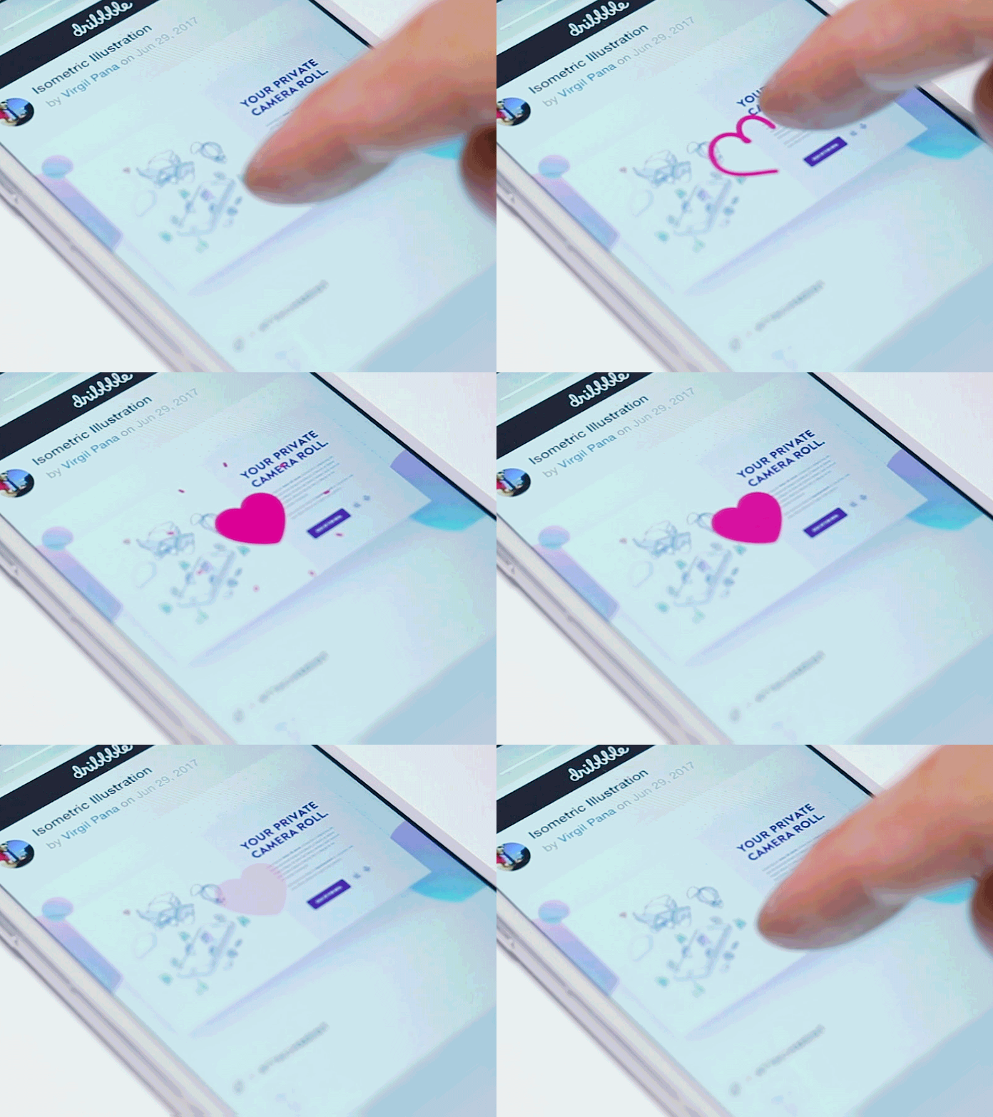
A gif to show a humanised interaction of liking something by drawing a heart on the phone screen
Functional Animations: Small Actions can Make a Big Difference
Animations within the user interface have started to become rather common in mobile app design, but now we are seeing more specific functional visual effects. Animations linked to gestures, like the pull-down motion, are changing the UI into a dynamic experience. They help to bring the interface to life and eventually could provide further control to the user. In regards to the user experience, functional animations are very helpful for onboarding as they provide further engagement for first-time users.
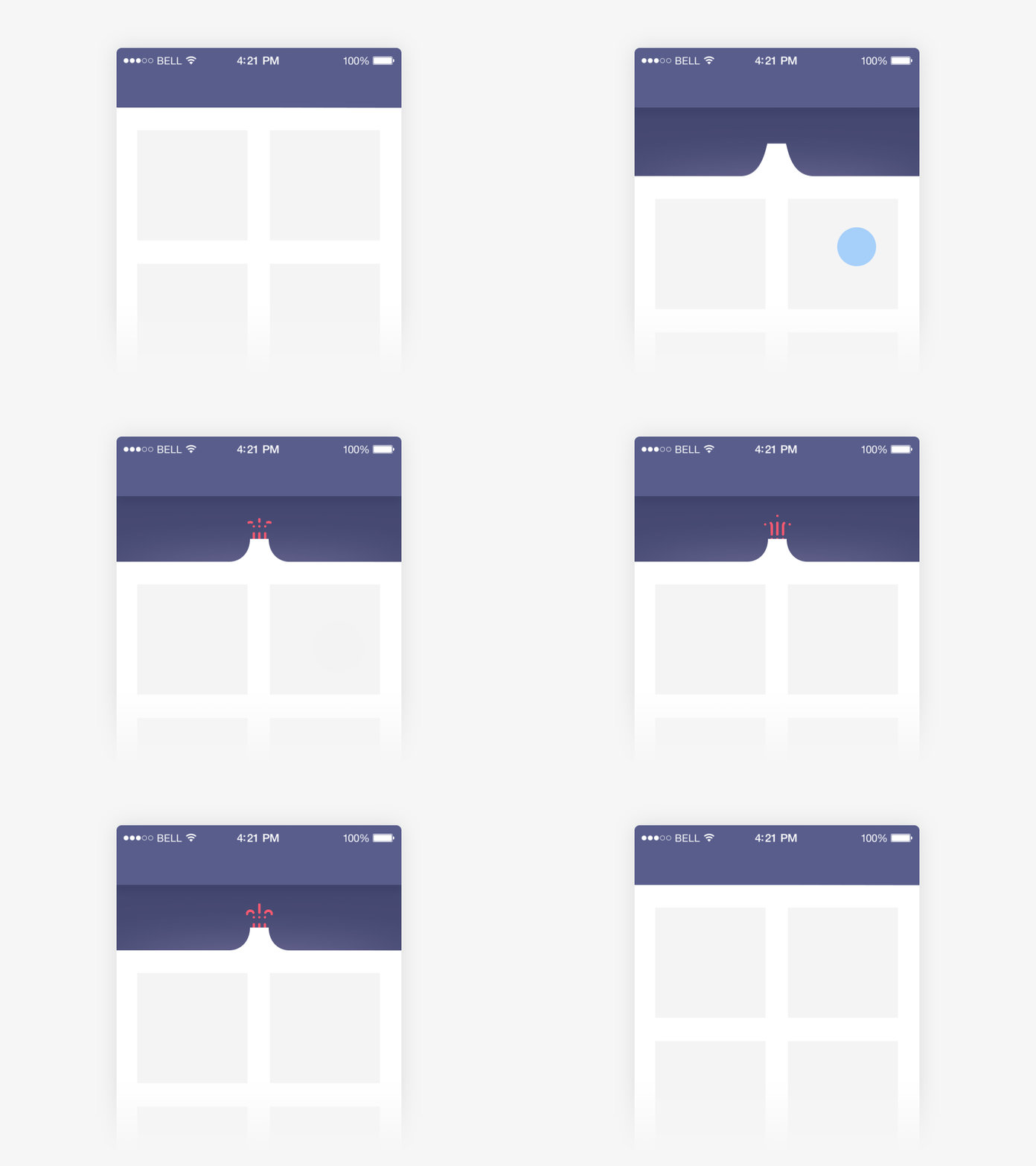
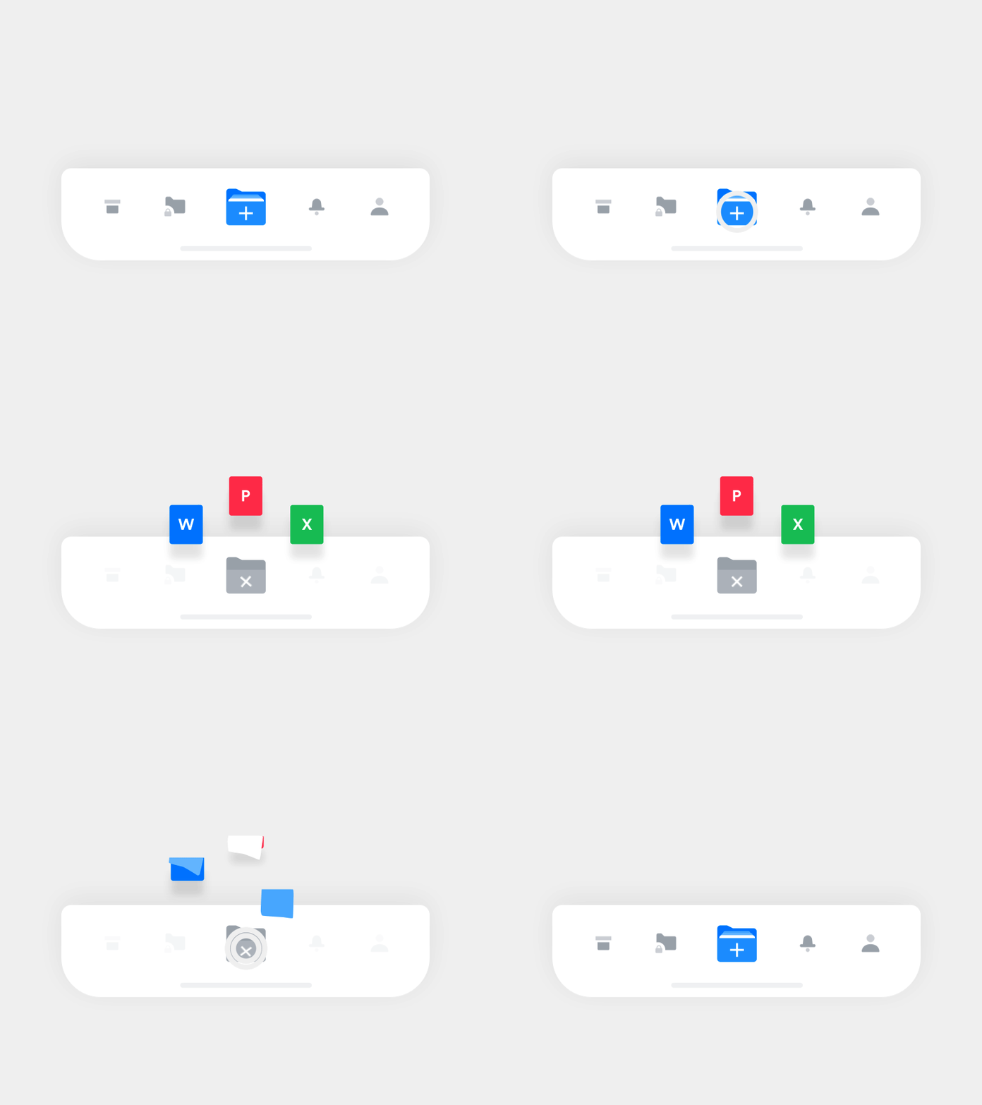
While from the designers perspective, they will need to consider varied aspects when involving such animations. This can relate to whether they expect to involve hierarchy in the animation or even if they are assuming to receive user feedback. We are also seeing smaller-scale involvements including functional animations in micro-interactions. These basic navigations are benefiting from small design touches such as the ability to create a new document shown below, which adds a somewhat subtle complexity to the button’s usage.
Open Composition: to Infinity and Beyond
The design of all-screen smartphones has substantially grown through 2018 and is set to continue into the following year. The need for a more sleek, borderless style allows app designers to think outside the box towards an open composition. This creative trend is somewhat easier to achieve in web design and has become rather common. But it is now beginning to transition towards the mobile design market, as the previous framed phones seemed to cause some design restrictions.
New Life of Custom Illustrations
In regards to the concept of open compositions, showing part of a whole image can actually make the phone screen seem larger while the ability to swipe creates more of an infinite composition. This is well-suited for the evolving popularity of custom illustrations. While the open aesthetic helps to fuel the user’s imagination, allowing for more interactive opportunities. Therefore this could form a mutual design bond between open compositions and the interactive user experience, allowing for immersive applications.
Vivid Colours, Gradients & Duotones: The Bolder the Better
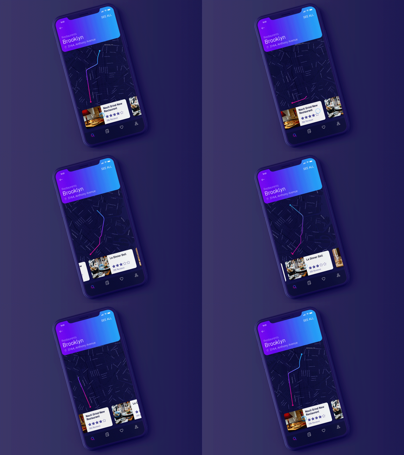
The transition from a calm colour scheme to the more vivid gradients and duotones may not be a new concept to designers. However moving into 2019 we are seeing the bolder and brighter colours being used across all aspects of app design, not just the background. The prototype map interaction by Mindinventory below shows the use of futuristic neon colours in a reactive gradient. The use of these vivid colours fuels the imagination and the evolving use of gradients provides further improvisation for designers.
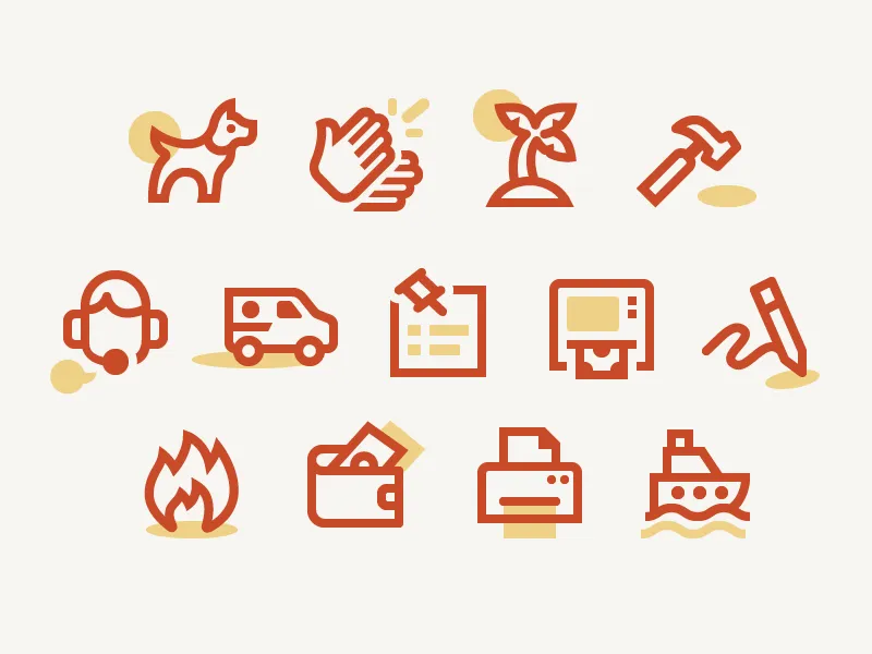
As well as gradients, duotones are showing continuity, especially since Spotify’s rebranding success. The simplistic use of closely related tones creates natural shadowing and depth. Iconography can also benefit from the use of duotones as we look into 2019, and the icons created for Australia Post are a perfect example of tonal shadowing. This type of style mutually suits the need for minimalism and even crosses into a more flat design, also expected to continue into next year.
Minimalism: The Simplest App Design Trend
The idea of simplicity and minimalism is obviously not a new concept but it has gained further traction over 2018. Popular apps like Instagram and Airbnb are perfect examples of simplistic redesigns. Minimalism is a design trend centered around the basics;
- Typography
- Contrast
- Negative space
- Organisation
- Simple or ghost buttons
- Stroke and fill
Yet the modern use of minimalism seems to be moreso geared towards the user experience, merging the roles of UX and UI designers.
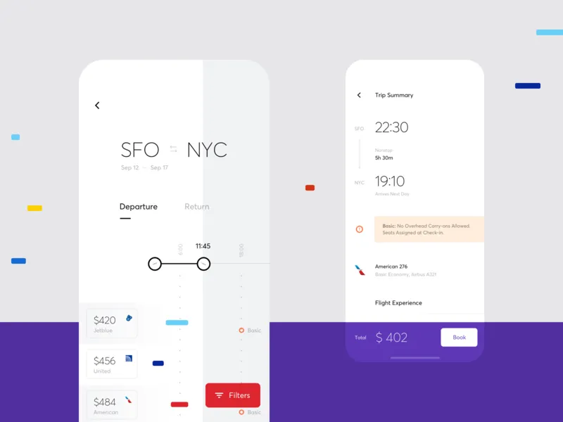
Moving into 2019, the use of minimalism is only going to grow. Carving apps down to a bare minimum meets the simplistic navigational needs of the modern-day user. And the correct use of negative space provides clarity. In some cases the typography will become the primary content. However, there is a fine line to perfect this concept. Something too simple will not contain focus or purpose.
Semi-Flat Design: Adding an Extra Dimension to the Aesthetic
Flat design has been very popular in graphic, web and mobile app design for quite a few years now, but this design trend seems to be taking a new shape as we enter 2019. Semi-flat design seems to provide visual maturity to a design through the addition of tonal layers. These added layers can create simplistic gradient shadows that trick the eye into viewing the design in a more three-dimensional manner. This dimensional flat style can be mutually helpful for responsive animations, as each layer can move in its own way.
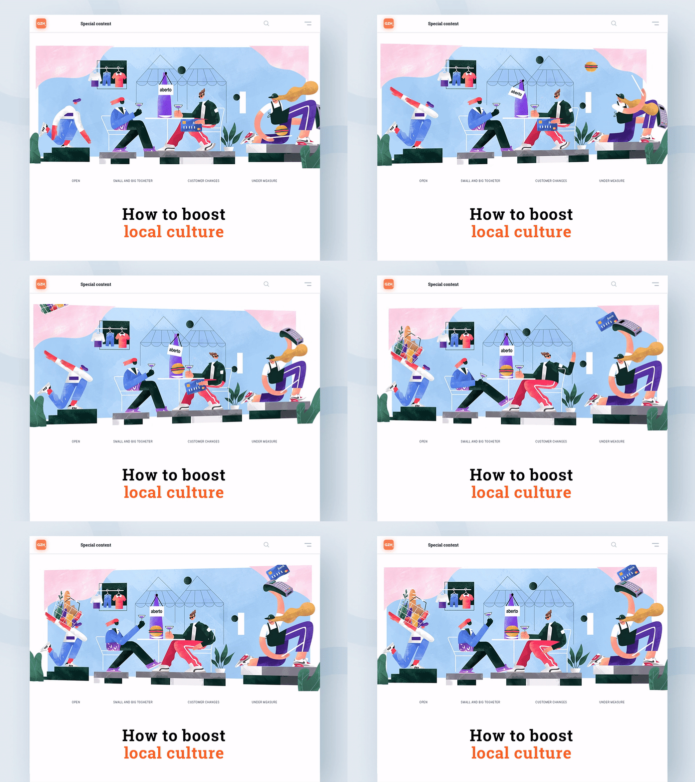
In relation to the typography of such an app, a simple sans serif is generally well-suited, creating a trend that goes hand-in-hand with minimalism. Such simplistic layouts can also aid load times and provide benefits for user navigation. However, this rather artistic style can be difficult to do well. The use of flat design is obviously popular, therefore aiming for a unique sem-flat design may be challenging.
Independent Resolution: Bigger Screens Means Adaptive Images
The need for high-quality images is paramount in modern app design, and the increased screen sizes with improved resolutions create challenges. For the following year, apps must achieve density independence, maintaining the size of the UI design when displayed on varied pixel densities. User interface design is starting to involve ‘density independent pixels’ (dp) as the unit of measurement. The value of the independent pixels is then converted to the correct number of real pixels for the relevant density.
New Format of Texts and Image Files
Even text sizing and image file types should be re-imagined. Text is now being sized through the use of scalable pixels (sp), allowing for seamless reactivity. While.webp. and.webp. image files will be replaced by SVG’s (Scalable Vector Graphics). Instead of using pixel bitmaps, vector graphics create images using XML, therefore can scale to any size without scaling artifacts. The importance of this app design trend will hopefully shape the norm of mobile application design in 2019.
Priority+ & Tab Menus: The Future Is Simpler without the Hamburger Menu
From a designers point of view, we all know the three-tiered ‘hamburger’ menu that seems to have been a default option for many apps. But this design trend just seems to be over-saturated and out-of-fashion. Unfortunately, when you look at the design of a hamburger menu it is not a very strong representation of an app’s potential. The menu items contained within a ‘hamburger’ seem to have less importance when they should be more equal. And also, as screen sizes increase, our hand sizes do not. Reaching for the top-left corner is gradually becoming more difficult.
Priority+ menus or tab menus have become the next best option.
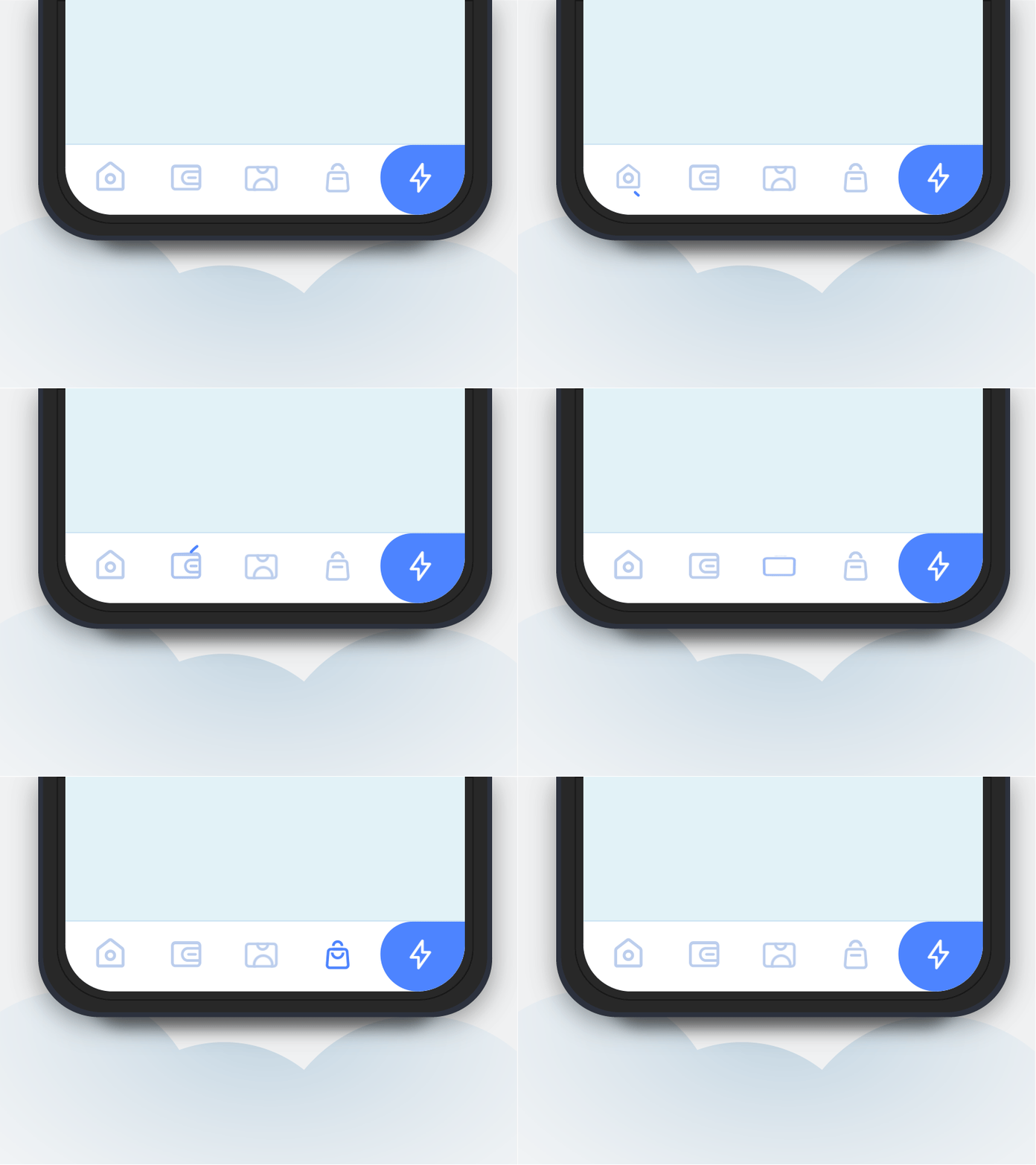
These dynamic designs provide more stable hierarchy to the menu items. And in regards to modern UX principles, the reactive Priority+ menus suit varying screen sizes and pinch zoom capabilities. Examples of the transition from hamburger to tab menus include Facebook and Spotify, which will only continue into the following year. The tab menus are also generally located at the bottom of the app to avoid any thumb cramp.
Conclusion
After collating these projected app design trends 2019, it seems there are two sides to the coin. On one we have the continuity of minimalism through an evolving semi-flat design trend and the transition towards simplistic tab menus. Whereas the other side shows a need for a more colourful, artistic experience through vivid gradients, open compositions, and the newly titled natural experience. However, this is no surprise as it just reinforces the fact that there are two types of people in the world, minimalists and eccentrics. And the mobile app design world will always try to please everyone through innovation and creativity.


