The Magora experts share experience on how they create great designs using colour, contrast and content.
While working on the interface of a website or mobile app, our designers think not only about beauty, aesthetics, and the latest trends, but also about how people perceive structure and content, and react to it. Today we will talk about the magic formula "3C" in the interface design (
Colour
In the visual arts, it seems that
In the UI design,
- Increase brand recognition;
- Maintain readability;
- Strengthen the call to action;
- Satisfy aesthetic needs;
- Improve navigation;
- Strengthen intuitive interaction;
- Decorate;
- Create a clear and harmonious style.
Here at Magora, we use
Contrast
Contrast is one of the key factors affecting the scanning and visual hierarchy of the page. It is effective in attracting the user's attention to certain elements, thus supporting intuitive navigation and the convenience of using a page or screen.
Contrast can be based on various features of the user interface elements, including:
- Colour
- Size
- Form
- Direction
When you hear "contrast" the first thing you imagine is something black and white. The monochrome image uses contrast as the primary amplifier. And it works in user interfaces too. Like in photography, the contrast in interfaces not only enhances
One of the first questions is “What general
- Clarity. This aspect includes the ability of the user to clearly see and distinguish all the necessary data on the screen or page. The
colour scheme should support easy and intuitive navigation, and effectively allocate the most functional elements of the layout. - Readability. This is the ability of users to easily read the text. Lack of readability can be a serious reason why users do not want to use the site or app, no matter how good they seem at first glance.
- Availability. When a lot of people can use your product without special guides - it's availability. This means that the decision to "use or not to use" should mainly be based on the needs and wishes of users, but not on their physical abilities. The
colour scheme problem is one of the main factors affecting this aspect. The designer should think about users of different ages, with special needs, and disabilities. - Responsiveness: the ability of the product to flexibly convert the layout to match the devices used. This often has a decisive influence on usability, since what looks elegant, attractive and understandable on a professional high-resolution monitor can turn into a dirty spot on a small screen with a low resolution. The
colour scheme and the contrast level affect this problem. - Environment: Select the appropriate
colour scheme and background type for the potential environment in which users will regularly or frequently use the product. In terms of constant use in natural light, a dark background can create a reflection effect, especially on glossy screens typical for tablets and smartphones. On the contrary, from the point of view of regular use in a poorly lit environment, a dark background can take light away from the screen.
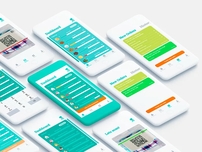
Content
There are a lot of types of content, such as:
- Photos: you can add thematic photos, creating the appropriate mood and transmitting a message, demo, subject photos in online stores, title photos for articles in blogs, etc.
- Illustrations: made in different styles, custom illustrations represent a popular trend in the UI design as they can look informative and original at the same time, which allows the design to stand out against the background of competition.
- Hero banners: applied mostly in web design. These are large images, which are usually the first visual elements that attract the user's attention in the first seconds of interaction; they make an attractive visual presentation of the main content of the resource.
- Icons: these are small but significant pics that support the data exchange between the informer and the addressee. The icons use a picturesque resemblance to the object of the physical world, play a key role in providing clear and intuitive navigation.
- Talismans: images, usually personified, which in most cases represent a brand name, product or service identification, and therefore becomes its symbol used in the app or on the site, packaging and promotional materials. They can both add something positive to the interaction, and increase brand awareness.
- Visual identification elements: these are various visual signs of branding, such as logos, corporate identity, and the like.
- Texts: another visual element of design. Must support the same philosophy as any other part of the layout: everything that is placed on the screen or page should be functional and purposeful. Everything should work for the user.
- Video: Creative and memorable video is a good way to attract customers' attention. The video makes the presentation strong and memorable, especially if it is based on high-quality graphic design and animation.
And finally..

To make the “3C” work, we adhere to the following principles:
- When choosing the
colour and using it in the user interface, we make it convenient and understandable.Colours increase usability, utilityand harmony. - Contrast helps to inform users about which points of interaction are vital and which ones are secondary.
- The success of an effective content directly depends on such design decisions as font selection, background, and placement.
The creative process involves many problems that our designers take into account. There are no universal solutions: for each
Read more about how to create a pixel-perfect UI here.
If you are looking for a unique design, want to increase user satisfaction, and achieve your business goals, contact

Alexander Bessudnov
Alexander is an accomplished Chief Product Owner with a proven track record of leading successful product development initiatives at Magora. With a passion for innovation and a keen understanding of market trends, Alexander plays a pivotal role in shaping Magora's product strategy and ensuring the delivery of cutting-edge solutions to clients.
LinkedIn