Find out how to deal with errors and empty screens in app design.
So your app is ready for launch, but are you sure it can speak for itself?
Any brilliant idea needs a sparkling presentation. I’m sure everything’s great with your app, but let’s do a final check and make sure you’re ready for even the most unpredictable pitfalls.
Content is what makes your app valuable. In the first months of the product’s life cycle - especially when you start from an MVP development - and when a user has just installed your app, there may be problems with lack of information, blank screens and errors.
The phrase "There is no Internet connection" on a grey background looks rather sad, doesn’t it? In this article, we'll consider two types of screens - those with no content and those with errors - and give you tips on how to deal with them.
Blank Screens
Blank screens occur when there is no content on the screen or when a search shows no results. Since these screens are everywhere, we would propose creating templates with illustrations and text. This saves time in developmentand users are more accepting of such screens than of those with a few ascetic words.
Messages on these screens should be customised depending on the context of the app. This offers several good opportunities for contact with the user.
Training
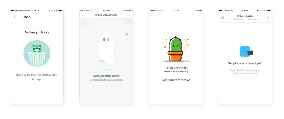
The primary task in designing empty screens is to explain the user why the screen contains no information, as well as what ought to be there. Here it is extremely important to adhere to brief and clear language.
Call to Action
So, we’ve explained to the user why the app screen is empty and what it is that’s missing. We won’t dwell on this further - the next step is to provide the opportunity to take action and gain access to the content. We recommend using motivational phrases to convince the user. Tell them about the benefitshe or she will receive and give clear instructions. We can add a CTA button or an arrow that leads to it. Read more about call to action here.
Good impression
Empty screens are functional, but that doesn’t mean they should look dry and boring. We can make them more "human", adding nice elements and animations to make an emotional connection with the userandleave him or her without a single reason to remove your app.
Application errors
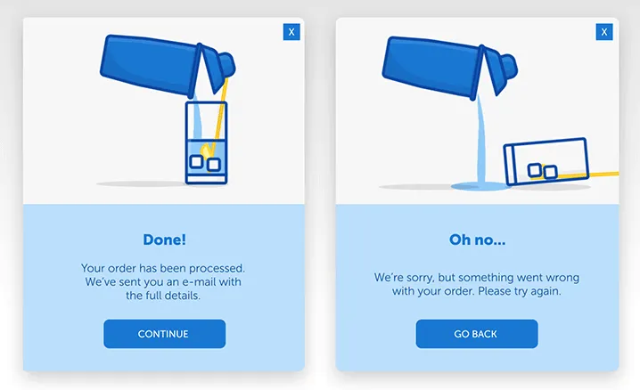
Errors may arise anytime and anywhere - no one is immune to them. It’s therefore vital to think about error messages and avoiduser disappointment.
Errors can occur for various reasons. These can be general errors in the app, in synchronisation and downloading of content, or problems connecting to the Internet. Tell the user what actions should to be taken to fix the error and, even if you can’t download new content, give them an opportunity to interact with the rest of the data in the app. Read aboutthe main errors you should test before launch and how to deal with themhere.
As an alternative, you can tell them the latest news about the app or even offer to play.
Finally
Don’t view empty screens and errors as a curse. This can be an excellent opportunity to turn a negative user experience into a positive one. We always recommend using a well-meaning tone, visually simple design and intuitive messages.
Our designers always strive to resolve the following points on these screens:
- What: a description of the content;
- Where: an explanation of where the user is in the app and where he or she can get from there;
- When: the moment of the product’s development and a description of the action or event required for the data to exist in this screen.
You have only one chance to make a first impression - we can help you make it enjoyable.

Alexander Bessudnov
Alexander is an accomplished Chief Product Owner with a proven track record of leading successful product development initiatives at Magora. With a passion for innovation and a keen understanding of market trends, Alexander plays a pivotal role in shaping Magora's product strategy and ensuring the delivery of cutting-edge solutions to clients.
LinkedIn