Must Know Mobile App Design Trends 2016

Users that are on-the-go demand mobile apps that anticipate their needs and deliver what they want. Fortunately, mobile devices are becoming more and more powerful. Now, 3G has given way to three types of 4G with fewer restrictions on bandwidth and power. However, the emergence of larger smartphones and wearable technology present a new set of demands for mobile app developers, as they work to incorporate social trends and changes in technology. The top trends in mobile apps range from the features of successful apps being copied, to new styles and techniques taking over from older design practices. Here are the
Don’t Reinvent the Wheel (‘’Instagram effect’’)

Photo sharing apps are more popular than ever, with Instagram remaining ahead of the game. The app is so successful that many new photo sharing apps are developed to mimic Instagram’s features, such as their instant effects preview and filters, their functionality, navigational structure, feed browsing display, and user interface.
Backgrounds
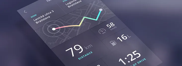
The background to an app is essential for readability. A blurred background can make an app much more readable, as well as being easy on the eyes. It is also highly effective as the user retains the custom feel of their personalized background. Colors in 2015 are softer, gentler, and much more subtle than previously.
Keep Designs Simple
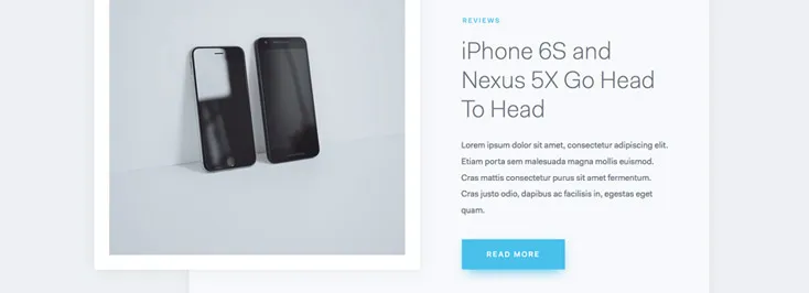
Clean, sparse, minimalist designs are a huge trend. Menus and navigational headings are much
Clear Easy to Read Text
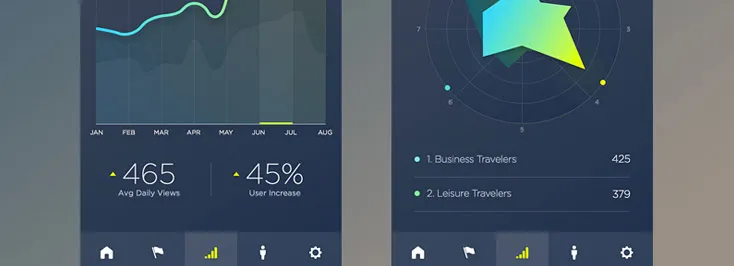
Originally, mobile apps were largely text-based for faster loading over a slow connection; a clear demonstration that text-driven interfaces can be highly usable. When text is unencumbered by other elements and is large, clear and easy to read, it works well. The relevant information is available at a glance - ideal for users on the go. Take for example a summary of the current weather conditions; keywords and an icon are the perfect
Design for Larger Screens

Smartphones are getting bigger and phablets are becoming more popular. Mobile app designers have to consider how the devices are held so that the most important navigation elements are the ones that are most easily accessible to the thumb. Around 10% of users are left-handed, so ideally, interactive elements need to be accessible from either side of the screen.
Integrate Swipe Navigation
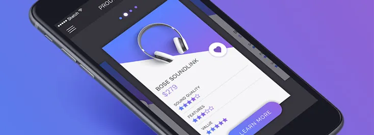
With the emergence of the smartphone, developers were faced with a whole new set of demands for mobile apps. As well as pinch to zoom, the evolution of the smartphone now means swiping the screen to navigate a website. Swiping is much more comfortable and natural for the fingers than tapping the screen, and is a technique that has proved phenomenally successful - take for example Tinder; users swipe left or right depending on whether they like what they see when they view a potential date’s profile.
Don’t Forget About Wearables

Larger screens and phablets have created a demand for complimentary smaller screens that can be worn on the person, the most popular being wrist-wear. The release of Android Wear and the Apple Watch mean a demand is present for apps that deliver content the user can digest with a quick glance. Color, contrast, and typography
Layered Layouts
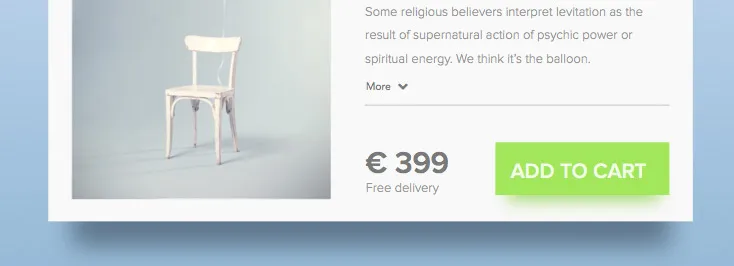
Layered layouts merge flat designs, whereby the elements are geometric in nature, with natural physics. Designs replicate how objects in the natural world move and interact with one another, using shadow and light for effect. This mimicking of metaphors in the natural world manifests itself when the user slides objects around the screen, casting shadows and appearing to have weight and motion. Flat design has the added effect of muting the shine, which is easier on the eyes.
Colors
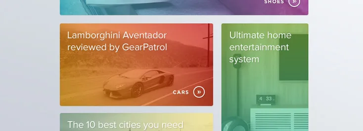
In the past, apps made use of bold primary colors, gradients and matte finishes to provoke a user response and leave a lasting impression. 2016 has seen softer, cooler color schemes and subtle, warm tones. Textures and patterns are used to make application backgrounds unique, such as wooden panels and semitransparent menu items, so that the background shows through for effect.
Smarter Prototyping
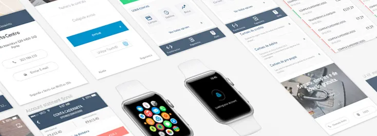
With today’s prototyping solutions, designers can communicate their intentions with developers clearly and precisely. No knowledge of coding is required to create a proof of concept that demonstrates how the app is to be used. When the time comes for the developer to create the app, the process will have been simplified and there will be less need to code endless rounds of revisions. The prototype can be tested on multiple devices to ensure compatibility across resolutions and operating systems.
User is the King
User-friendliness is on the top of the list for any mobile app designer, and so developers are thinking critically about UX. The main trend in app design is to analyze the users’
There you have the leading app development trends for 2016. Follow these, and you will be successful in creating unique, accomplished, and efficient mobile apps in the coming year.


