Responsive design helps you make websites fit multiple screen sizes. Let us show you some great tips and tricks for improving and getting the most out of your site.
Designing your website to be responsive may be simple enough, but maintaining all the elements to look aesthetically pleasing and well-balanced on every screen size is an art that requires in-depth knowledge of CSS. In this article, we reveal some useful CSS tips and provide you with coding samples that can help make your responsive website look
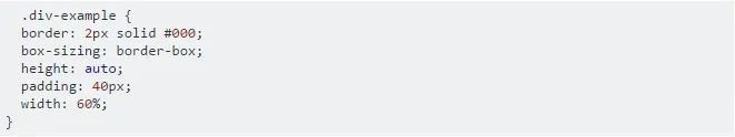
Box-sizing
You may be surprised, but box-sizing is an essential property for responsive website development. If you use box-sizing on an element with a width set in percent, it will take padding into account, so you’ll no longer need to adjust the width. Needless to say, this trick works best for mobile websites and browsers with CSS3 support.
Responsive Video
This CSS trick makes video content expand fullwidth to the boundary. To make it happen, you need to place the embed video code into a <div> container and specify 50-60%

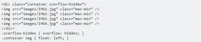
Overflow Properties
Overflow: hidden is a handy CSS property that is helpful in many cases in addition to responsive design. Instead of clearing divs, you can clear containers by simply setting the overflow value to hidden. This property may be used for both complex and simple apps, making them much cleaner and relieving the necessity of having extra clearing divs.
Min-width & Max-width
- The max-width property enables you to set the maximum width of an element. The purpose of this property is to prevent the element from becoming larger than the boundary.
This example shows the container specified to display at 700px if possible without exceeding 80% of the boundary width: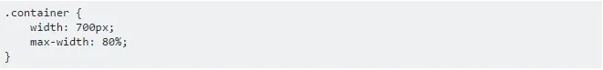
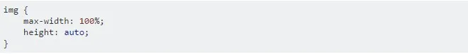
In the case of images, you can make them automatically resize to maximum width by using the max-width:100% and
- Min-width is the opposite of max-width. It determines the minimum width of an element. For instance, you can use the min-width property on the input text field to prevent the field from getting too small when scaled down. It is applied in exactly the same way as in the max-width examples.
Knowing such simple yet handy tricks easily enables you to take care of the responsiveness of your website even if you are not a CSS pro. If you feel that even this is too much to handle on your own, get in touch with our mobile app development company team and we will go all out to

Nick Selin
Nick is a Consulting Director at Magora. He focuses on driving growth and creating valuable partnerships. With a sharp eye for market trends and a natural ability to connect with people, Andrew leads initiatives that keep Magora at the cutting edge of innovation and success in the tech industry.
LinkedIn