15 Tips for Pixel-Perfect UI: App Design Guide

What do you know about UI (user interface) and UX (user experience), other than their being key factors to be considered when developing mobile apps? Not much? Meanwhile, these two notions define everything about your future app, from appearance and usability to the success of the whole project.
- If your goal is to build a star product, no matter how much you’re ready to invest in your UI app design, you should consider the interface fundamentals we’re going to discuss in this article.
1. Pay Attention to Graphics
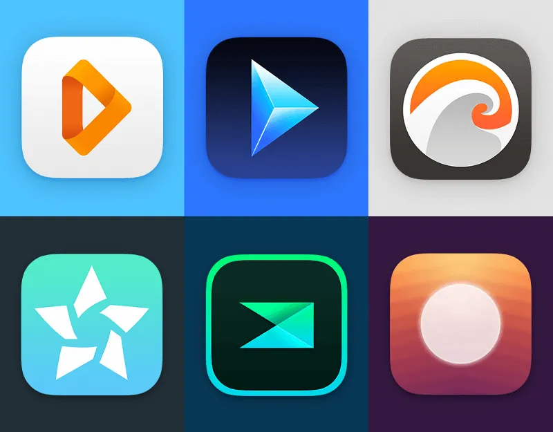
For graphics, average developers often follow the "one size fits all" rule, but here at
2. It’s All About Users
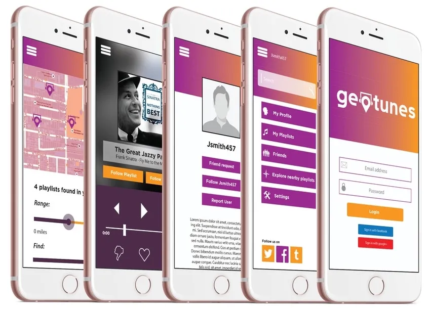
It may be common knowledge, but you need to know your users inside out. This includes all the demographic data your analytic app can track. More importantly, you should know what they need and what problems they face. This requires great compassion for a user, for whom you have to go beyond basic statistics. You may talk to them face-to-face, or watch them using your product, or even ask for their feedback on the UI design. This is not about what they want. Go deeper and guess what they need. If you meet their needs, thus giving them what they want, you’ll automatically meet all their basic requirements. This information will help you make the right decision about your UI app design. Do not forget to check the statistics in your GA account, it will help you to see the user's reaction and interests.
3. Responsive at Every Inch
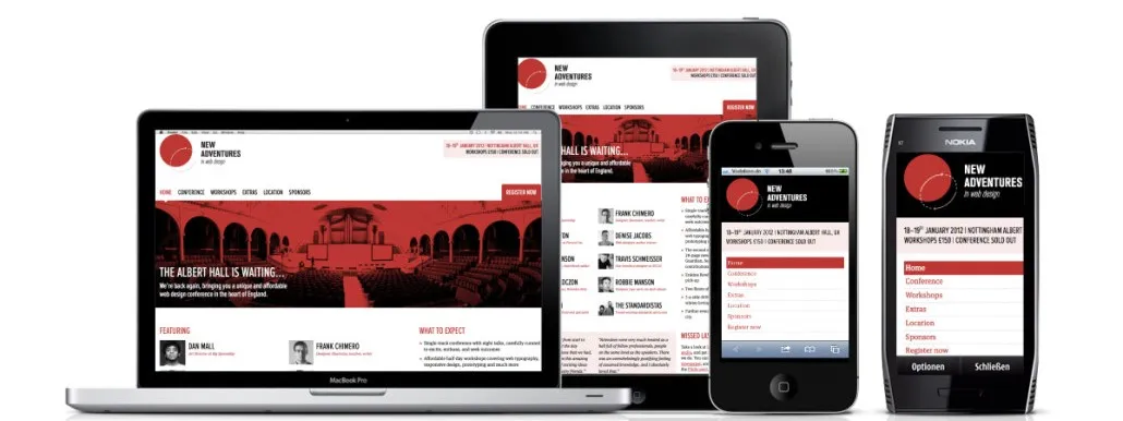
Note that the UI should be designed to make the app fully available on many mobile devices and operating systems. Whether adjusting media queries, CSS or JavaScript, all issues related to displaying apps on multiple mobile devices should be handled responsibly.
4. Suitable Format
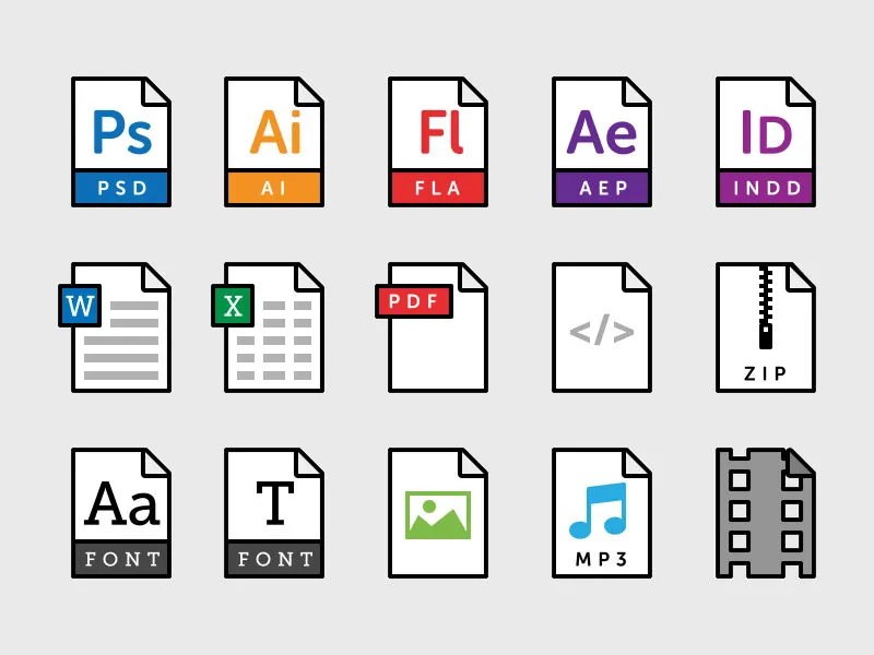
We’ve all encountered apps that hang when loading large
5. Iteration is Key
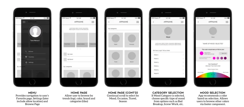
The best way for UI developers to create a highly interactive mobile app that keeps users engaged over time is to iterate interface design options. Keep in mind that each iteration is a valuable lesson for improving performance and making adjustments before the end product is ready for launch.
6. Colours with a point
<
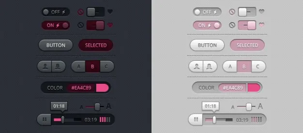
One of the main application design trends in 2018 is to use subtle animations to switch between screens and to use different UI control
For example, if there’s no activity on-screen, it’s hard to understand that your application is processing information. If the button
7. Preference for Round Corners
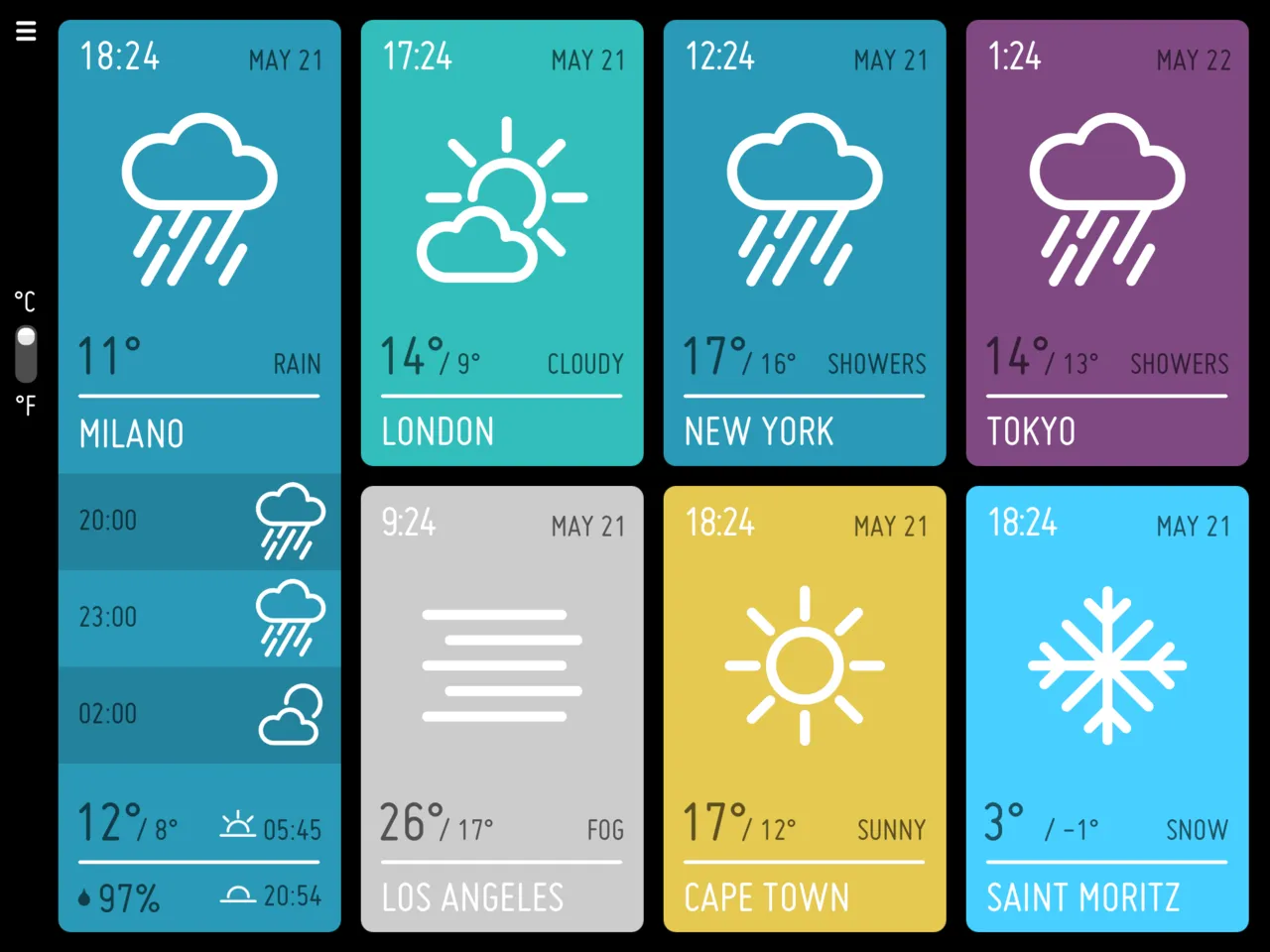
Typically, each UI element (a button or an image) shows a rectangular pixel on the screen, but this is not a rule to follow. You do not always need to keep sharp controls. It is better to include round corner controls to soften the look of the interface and make it more comfortable for users.
8. Keep it Simple
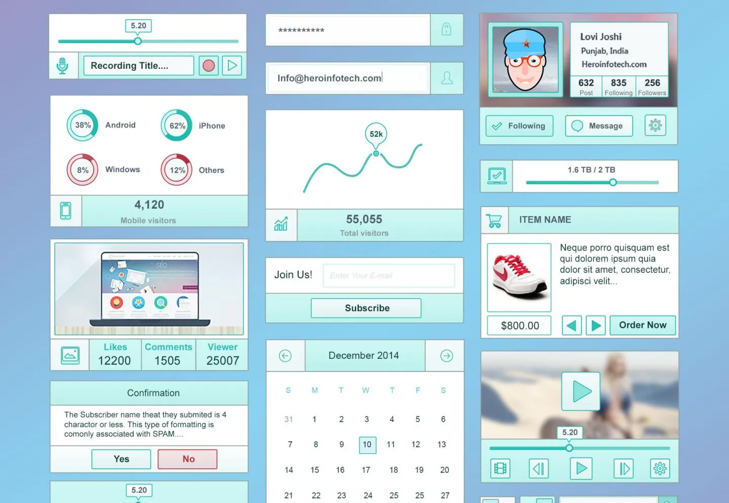
Keeping your design
9. Balanced Shadows
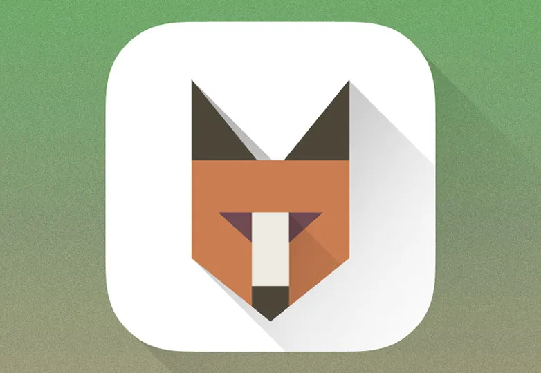
The latest version of Android offers holographic templates, 3D icons and more. If you’re using shadows and other styles in your controls, consider consistent lighting - i.e. the same positioning of shadows on the screen. The same goes for gradient; run consistent values in your graphics editor so you can have consistent textures and gradients.
10. Contrast View
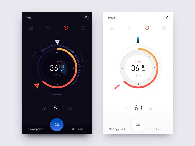
When you receive an email full of bizarre
11. Large Fonts
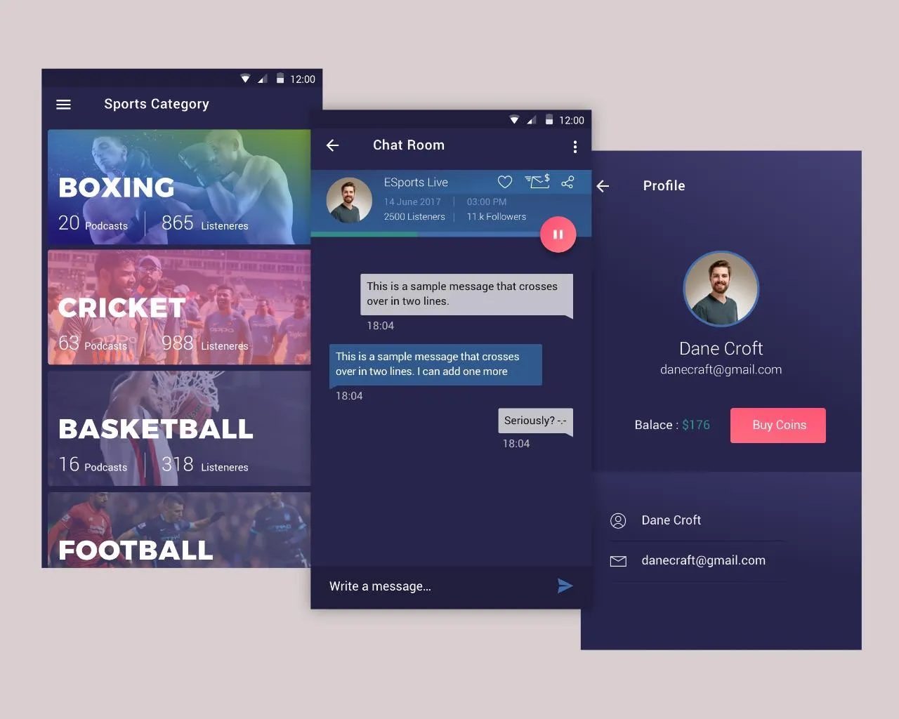
Much like bizarre
12. Comply with Platform Guidelines
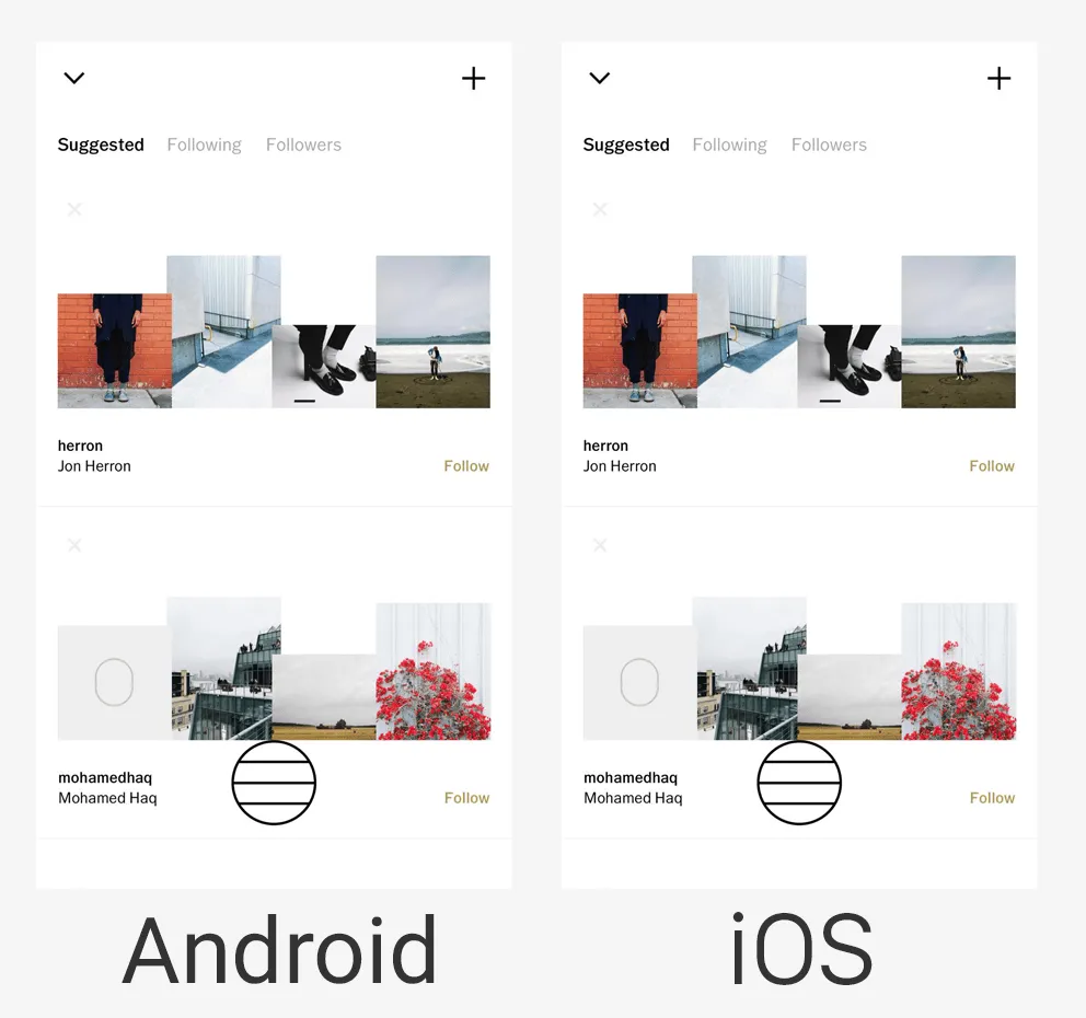
Many mobile apps benefit from familiarity. They create a simple and straightforward UI with controls for content. It's not a good idea to reinvent the wheel - simply incorporate interface controls and screen design into your content that users will accept.
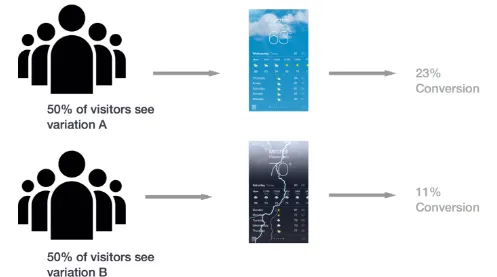
If you’re striving to innovate, remember to employ objective methods such as user search and A/B testing to compare a new version with the initial UI. This will demonstrate which version is preferred, more efficient and easiest to use.
13. Keep Real Users in Mind
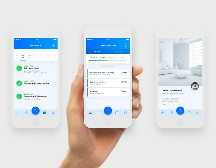
All professional UI app designers know that it’s always good to have real users in mind while creating an application design. This helps effectively evaluate what should be included and what should be cut out, thus avoiding unnecessary confusion and extra work when creating features. Such a strategy will not require re-working and will definitely save a lot of time and money.
14. Go for Beta Testing
Quality assurance and beta testing are the cornerstones of a successful mobile product. Once your application is up and running, it's high time for beta testing with another audience who are less aware of the UI design and its goals. You may have the misguided notion that people will find your app intuitive, which may not be the case. By placing your product in front of real people, you can reveal unforeseen issues that need to be resolved before release.
15. Manage Security Issues
Often, security and accessibility issues are addressed at a later stage in the app development process - this is why they ramp up the execution timespan. In a professional design and development team like ours, UI designers always communicate with backend programmers and other middleware experts to ensure that the appropriate data is published in a user-centric way. The strategy should be to reduce the user learning curve in order to improve the overall experience.
Tools to Advance Your Design Project
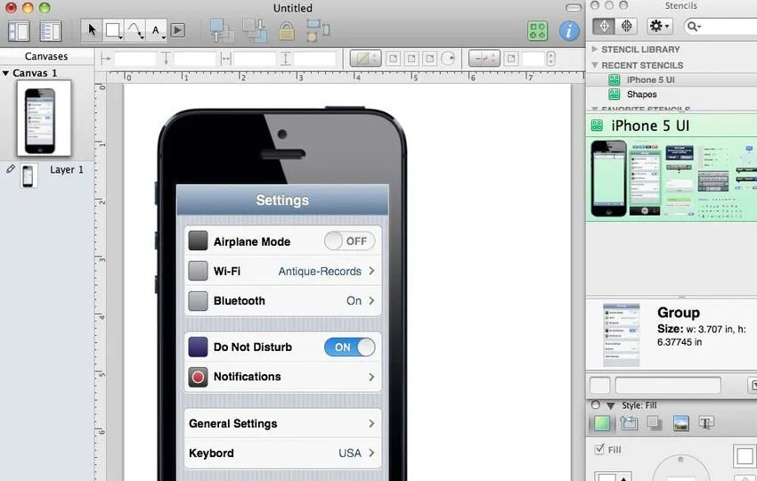
We know how complicated it can be to explain how everything should work in your future app. To help you
The three handiest mobile UI app design tools
These tools can help make your workflows, screens
Sketch. This super graphic design tool is similar to Photoshop but more focused on UI / UX design. It’s powerful, has a wide range of features and produces professional results.
Axure. If you’re looking for fully interactive interface wireframes, Axure is the wireframe tool for you. You can easily add interactions, create master pages, select elements and widget library patterns, import images, add
Marvel converts rough paper sketches into attractive prototypes that let you showcase
Conclusion
The attractiveness quotient of UI design for mobile applications depends on the target market. By following UI design guidelines, you can create products that are easy to understand and have a high availability ladder. As the world of app design continues to advance, our designers continue to learn it every day. We’re always ready to create something special for your company


